National Australia Bank - Bank Statement Review
Posted on by Angus Cheng
 The lowercase friendly NAB logo reminds me of Jeb Bush’s 2016 ‘Jeb!’ logo
National Australia Bank
- Formed in 1982 after the merging of National Bank of Australalasia and the Commercial Banking Company of Sydney.
- The 21st largest bank by market capitalisation.
- They have an Irish subsidary called Danske Banke, which was formerly known as National Irish Bank.
Sounds like a pretty good bank, but how good are their PDFs? We will answer that by reviewing one of their home loan statements.
Page 1
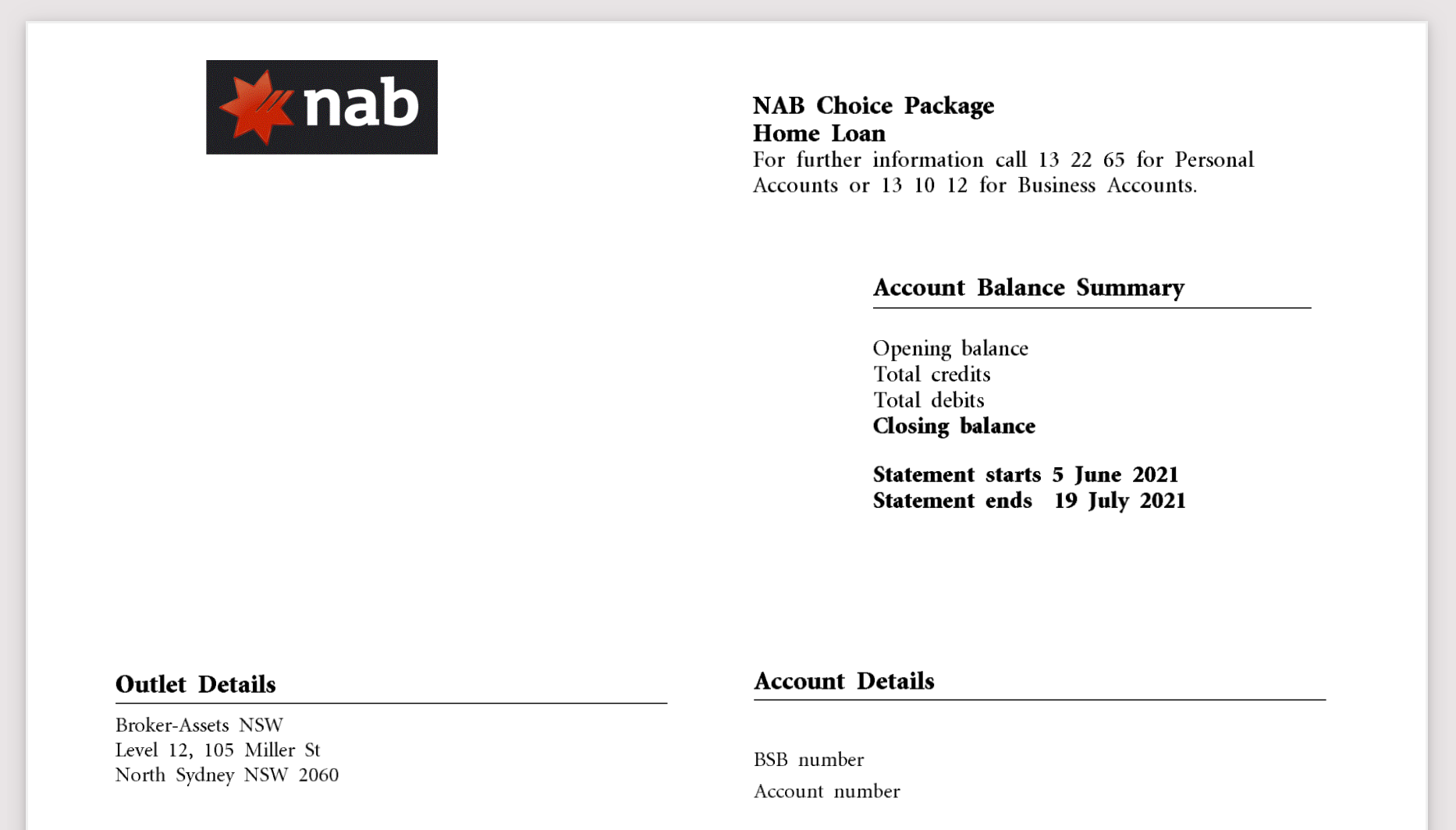
This is the header of the first page, it’s quite a reasonable statement, things are spaced out quite well. The elements don’t align very well though, for example the NAB logo and the text directly below it. I’ve redacted two barcodes from the above image. The first is a traditional barcode that you’d see in a supermarket product, the second looks like a barcode but the height and thickness of the bars varies.
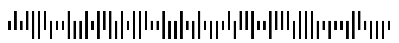
The second barcode looks like a Intelligent Mail Barcode, but that doesn’t really make sense since those are designed to be used in the United States.
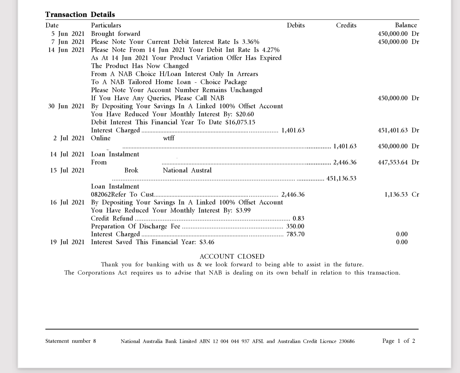
This is the body of the first page. I redacted a few references to the account holder’s name and some identifiers. The left most redacted vertical text seems to be an identifier for this document. The transaction table headers Date, Particulars, Debits, Credits, Balance are quite typical. The headers align quite well with the respective data, for example the bounding box for the “Date” header only intersects with dates “5 Jun 2021” to “19 Jul 2021”.
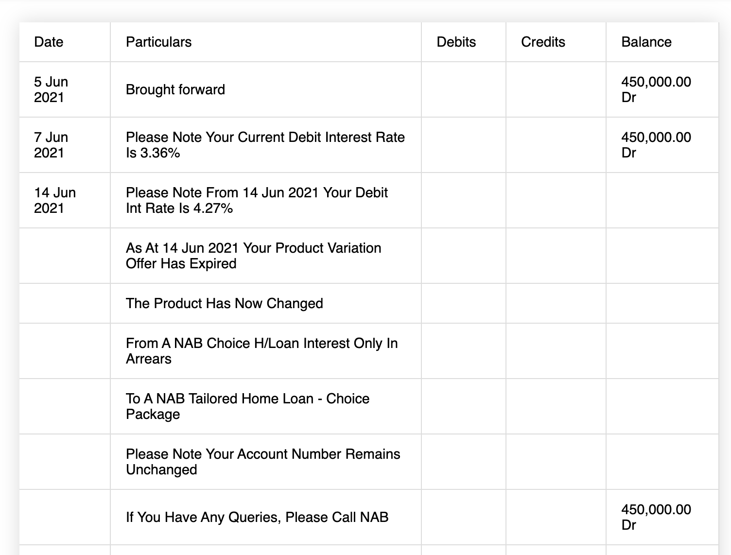
Once again we encounter non-transaction data in the transaction table.
Date         Description
 5 Jun 2021  Brought forward
 7 Jun 2021  Please Note Your Current Debit Interest Rate Is 3.36%
14 Jun 2021  Please Note From 14 Jun 2021 Your Debit Int Rate Is 4.27%
The last two rows describe state changes in the bank account. None of these records alter the balance of the bank account.
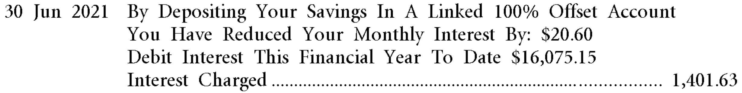
They’ve packed quite a lot of information into the description of this interest charge transaction. They let you know this interest charge has been reduced by 20.60 because you used some special account. They also inform you that from July 1 2020 to 30 June 2021 you have been charged $16,075.15 in interest. Also if you look really closely at this image you may notice the characters are quite pixelated. Is this because NAB are using a bitmap font?
Take a look at the block of full-stop characters between Interest Charged and 1,401.63. These characters look harmless, and perhaps are helpful to someone reading the document, however they massively confuse my algorithm. This is because my algorithm joins characters into text based on the distance between the characters, and then uses the bounding boxes of the text to figure out which header the text should be associated with. This means the text “Interest Charged…………………………………… 785.70” may be grouped into one piece of text, and then its bounding box will be associated with the Particulars column. Luckily I was able to get around this problem.
Page 2
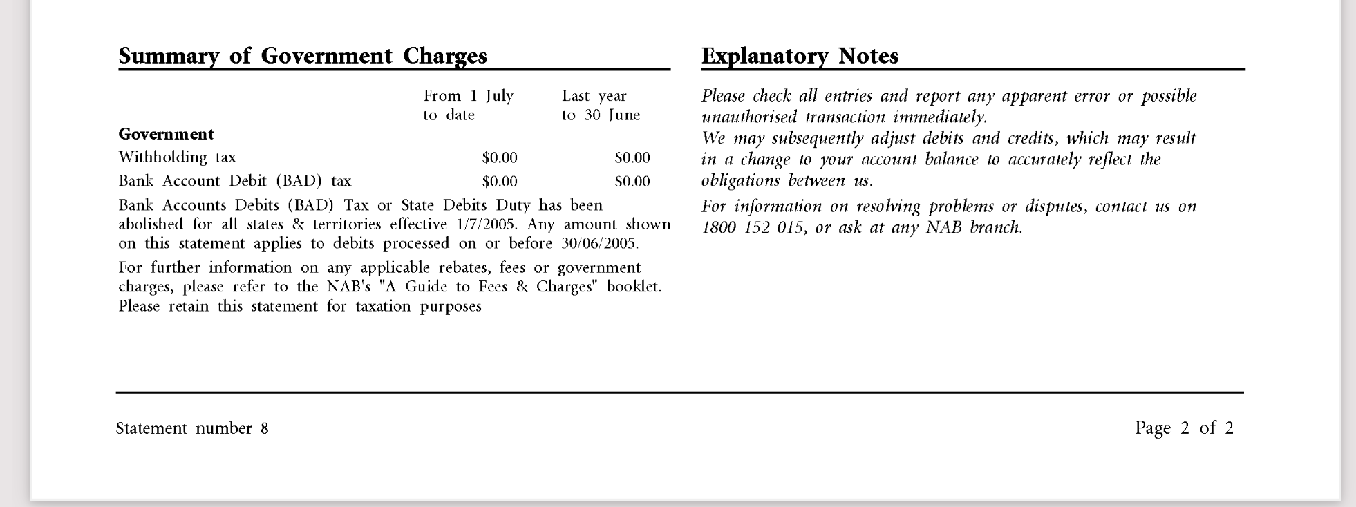
The final page blank followed by the above disclaimers. I thought this disclaimer was interesting:
We may subsequently adjust debits and credits, which may result in a change to your account balance to accurately reflect the obligations between us.
Are they saying that transaction values in the past may be adjusted? For example, do they have the ability to change the interest charge of 30 June 2021 from $1401.63 to $1400.00? I always thought bank accounts adjustments were done through additional debit or credit transactions.
Conversion Result
It converts pretty well. It would be nice to merge the descriptions into one line so that every row has a date, description and balance value.
Questions
- Why did they use a bitmapped font?
- How are the two barcodes used?
Final Thoughts
I quite like this statement. It’s relatively concise and doesn’t use a lot of colour so it should print well in black and white. The transaction table is quite hard to read and they’ve included some non-transaction items in the table. The bitmap font looks bad, even when viewed with 100% magnification. There are quite a few places where the description text intersects with the debit column. I feel like a table with lines would look better. The final page looks a bit silly because only the bottom 20% of the page is used.
Final score 7/10