HSBC HK Credit Card Statement Review
Posted on by Angus Cheng
 Are the people in this building good at making PDFs?
I’ve seen quite a few statements when helping customers get through issues converting bank statements. A lot of bank statements follow a logical structured format that is easy for a human to read and easy for an algorithm to extract data from. You’d think it’s something that would normalise into a standard format, banks would look at statements from other banks and copy the bank with the best statements. I suppose the quality of a bank statement format is something subjective. Let’s start off with HSBC Hong Kong’s credit card statement format.
Page 1
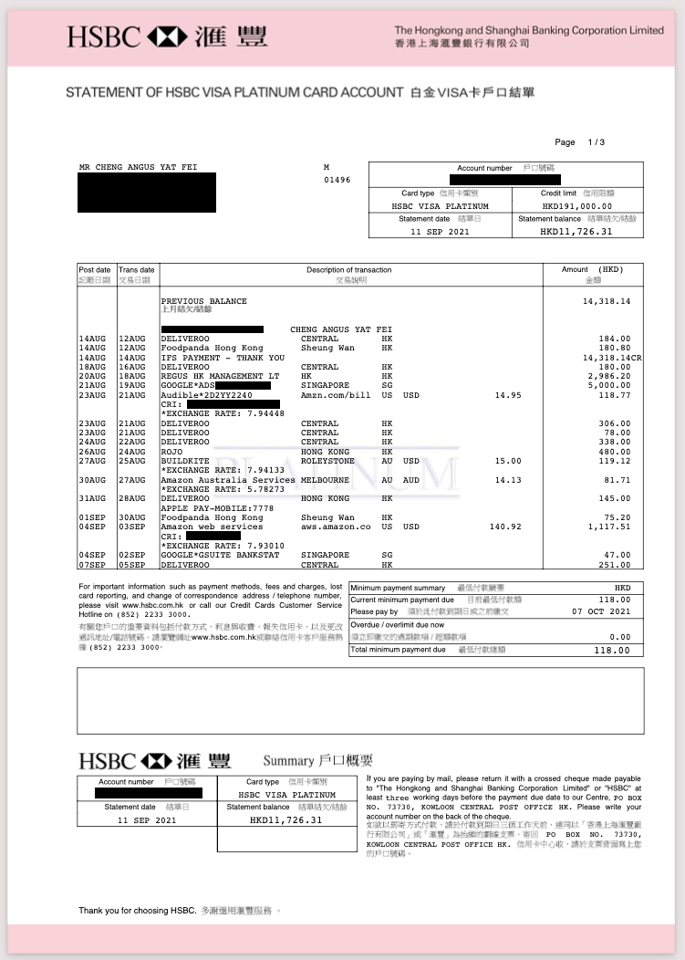
I think the first thing to notice is the pale pink header and footers, it sort of reminds me of carbon paper, I wonder why they did that. The header is made up of two elements, a logo on the left and some text on the right. I reckon the header looks pretty good, although it does seem like it isn’t exactly vertically centered in the footer. Next up we have the title of the document. Then we have a page counter, this is the first dynamic element we’ve come across. Moving down and to the left we have the account name followed by the account address. I’ve redacted my address from this document. Moving across to the right we have this M01496 text element. I’m not sure what this is. Does ‘M’ stand for male? I doubt it. Moving across to the right we encounter our first table. It has five dynamic elements and five labels in English and Chinese.

The interesting thing about this section is the Chinese text is not selectable. There is no dynamic Chinese text on the entire document so I assumed they were rendered as images but they aren’t. This will require some more digging.
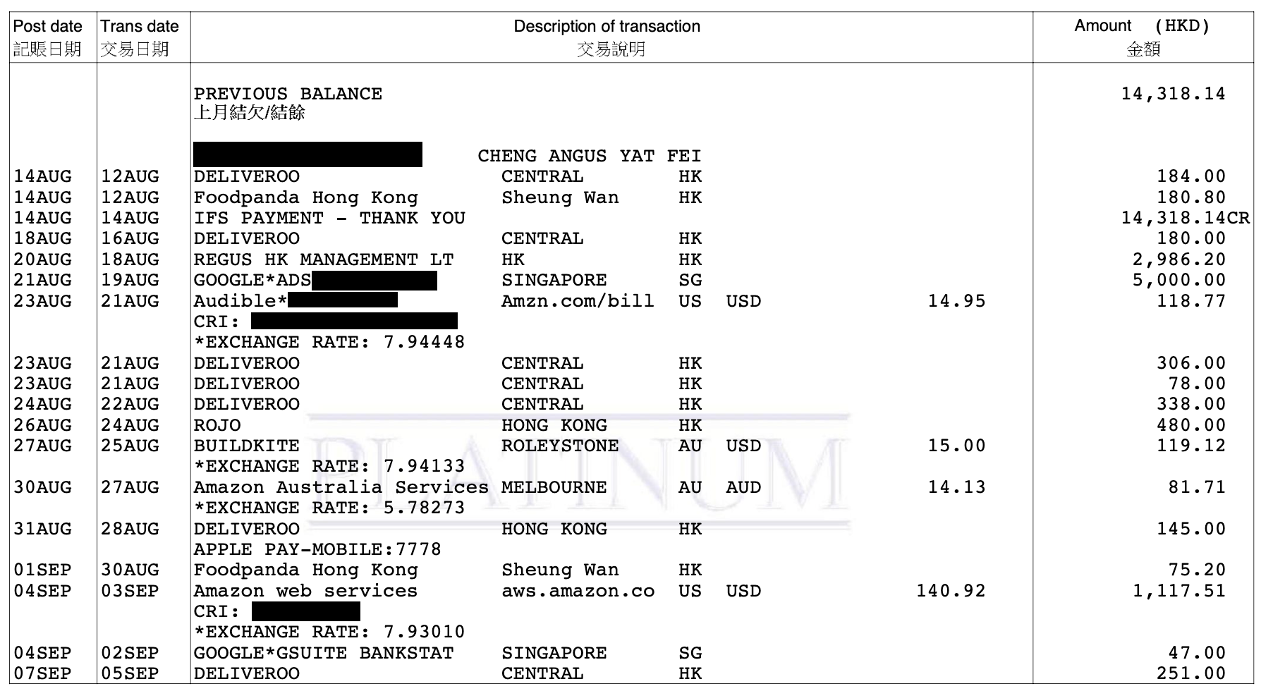
First off, let’s talk about the “Platinum” watermark behind the transaction table. I’m not sure why that’s necessary, it just makes the transaction table slightly harder to read.
Now we’ve gotten to the part that we care about, the transaction table. On first glance it looks like we have a list of transactions and each transaction has four fields:
- Post Date
- Transaction Date
- Description of Transaction
- Amount in HKD
However, the Description seems to sometimes be broken down further into four fields:
- Description
- Location
- Charge Country
- Charge Currency
- Charge Amount
The Charge Currency and Charge Amount fields are only present if the charge currency is not HKD. An interesting thing about the amount field is payments are marked with a trailing CR. So whenever I buy something with my credit card that would count as a debit and whenever I pay my credit card that would count as a debit. I suppose they don’t put in a trailing DB for all the credit card charges because it would add noise to the statement and perhaps it would make me feel bad about spending money. My generic statement processor is not able to parse five fields in the description, however if you need a custom parser I’d be very happy to help you build that.
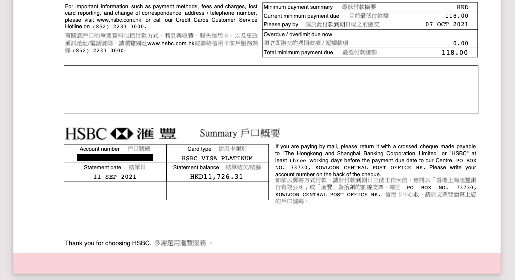
The footer is pretty standard, there’s some information about how to report a lost card. Some information about the payment due. Strangely there’s a big empty rectangle. I wonder what that’s for. Then in the bottom left they’ve gone and repeated some information that is available in the top right of the page. Interestingly they’ve repeated four of the five fields in the top right of the page, and left out the credit limit. To the right of this redundant information there’s a block of text telling you how to pay by mail. Then right at the bottom they thank me, and under the thank you we have a nice pink rectangle.
Page 2
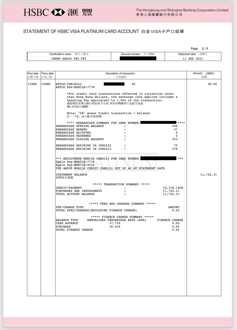
We’ve got the same pink header, a page indicator and some account and statement details in a table. Then we have a huge transaction table, however pretty quickly we notice there is only one transaction in the transaction table and the rest is unrelated data. Next we get some information about fees for foreign currency purchases. Then we are told what the letters CR mean in the document. After that we are shown our ‘Rewards Points’ balance. Followed by some information about Apple Pay. Followed by a transaction summary and finally we have the interest charges.
Page 3
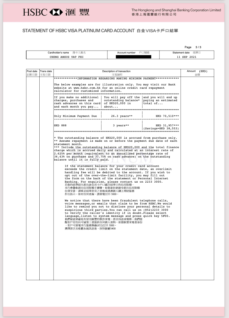
Something fun is happening here, HSBC provides us with two hypothetical situations:
-
You owe $20,000 on your credit card, and decide to pay the minimum amount. In this case it’ll take you 26.3 years and you will end up paying HSBC $70,510
-
You owe $20,000 on your credit card, and decide to pay $888. In this case it’ll take you three years to pay back and you will end up paying HSBC $31,957
I thought it would be fun to verify these numbers. Scenario #1 is a bit hard to verify, because I don’t know what the minumum amount is, and surely the minimum amount changes based on the balance you owe. So I wrote some code to simulate the payments.
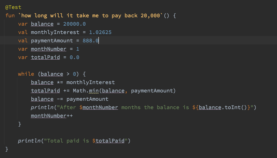
After 1 months the balance is 19637
After 2 months the balance is 19264
After 3 months the balance is 18882
...
After 33 months the balance is 1309
After 34 months the balance is 456
After 35 months the balance is -419
Total paid is 30660.33036145866
In my simulation the debt is paid off in 35 months and a total of $30,660 is paid to HSBC. I’m not getting the same results as HSBC, are they wrong or am I wrong?
Conversion Result
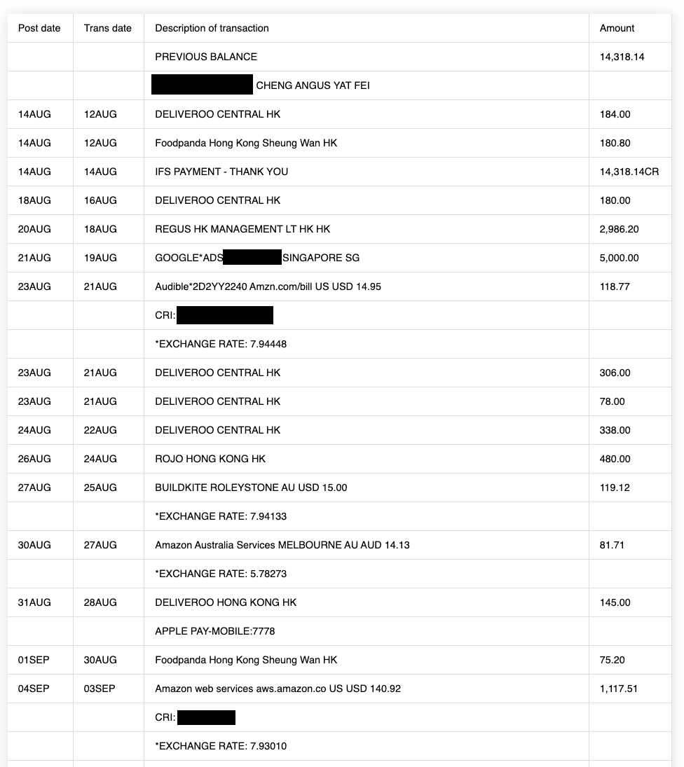
Running this statement through bankstatementconverter.com works pretty well, except it picks up a lot of the trailing junk.
Why is there junk in the transaction table?
I have a feeling once upon a time, HSBC didn’t provide the disclaimers, interest payment table and rewards cash information in their statements. Maybe they had some software that would take in a list of transactions and create a PDF file. Then one day, the government of HK had a thought:
“People have too much credit card debt! It must be because they do not understand the dangers of paying the minimum balance on your credit card debt. We need to write a law to force banks to show what happens if you pay the minimum amount on your debt.”
So then the law passes, and some programmer in HSBC HK is told “Hey you need to add this static text to the PDF statements”. He then goes through the code and realises it would be really annoying to add an additional table to the document, so instead he just jams it into the existing table and pretends it’s a transaction line item. From then a standard was set, and whenever things needed to be added to the PDFs they just jammed it into the description column of the transaction table.
Final thoughts
In some areas this statement looks really good. I really enjoy the leading and trailing pink areas. There are a few areas where the padding is inconsistent. I dislike the bitmapped Chinese text, I’m sure it’s possible to bundle a Chinese font into the PDF. The duplicated information on the first page is a bit stupid. The worst part of the statement is the non transaction data included in the transaction table. This particularly annoys me because it confuses my Bank Statement Converter, but it’s also annoying for the person trying to read the document.
Final score 5/10
